It is very easy to create responsive layouts in Tailwind CSS, and it makes most of the CSS concepts easier to implement, creating a responsive grid can be as easy as writing just a few lines of code without writing any media queries.
Setting up Tailwind CSS in an HTML file.
We can use Tailwind CSS in two ways
- Installing Tailwind CSS with NPM
- Using Tailwind Play CDN
but in this tutorial, we are going to use Play CDN for quick setup.
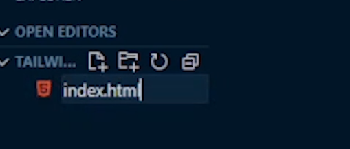
1. Create an HTML file as shown below
<!DOCTYPE html>
<html lang="en">
<head>
    <meta charset="UTF-8">
    <meta http-equiv="X-UA-Compatible" content="IE=edge">
    <meta name="viewport" content="width=device-width, initial-scale=1.0">
    <title>Document</title>
</head>
<body>

</body>
</html>