React Toastify lets you add toast/notifications to your application within minutes, and using it is relatively easy.
It provides so much customization that you feel like it’s an all-in-one notification solution.
Below is the step-by-step guide to install and use Toastify in your Next Js or React Js applications.
Step 1: Setting Up Project
You can use React Toastify in React Js or React based frameworks like Nextjs.
Make sure are have already set up your Nextjs or React Js project.
This is how my project looks like
Step 2: Installing React Toastify
Open a terminal inside your project’s directory and run the below commands to install react toastify in your project.
For NPM users
npm install --save react-toastifyFor Yarn users
yarn add react-toastifyStep 3: Importing Toastify component
To use react-toastify we have to import the ToastContainer component to render the toasts and toast the function also called as emitter to create new toasts.
import { ToastContainer, toast } from 'react-toastify';We also need to import default CSS from react-toastify library to show the notifications correctly.
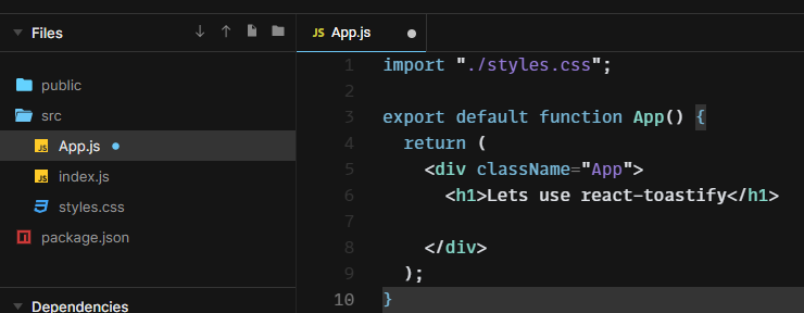
import 'react-toastify/dist/ReactToastify.css';Now this is my App.js
import "./styles.css";
import { ToastContainer, toast } from 'react-toastify';
import 'react-toastify/dist/ReactToastify.css';
export default function App() {
return (
<div className="App">
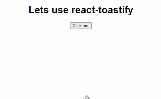
<h1>Lets use react-toastify</h1>
</div>
);
}
Step 3: Using Toastify component
Now we can place <ToastContainer/> component anywhere in our component, this is the most necessary step because, without this component placed in our code, we cannot show the Toasts or Notification.
ToastContainer gives the housing to the Toast messages shown later with the help of toast function.
import "./styles.css";
import { ToastContainer, toast } from 'react-toastify';
import 'react-toastify/dist/ReactToastify.css';


export default function App() {
  return (
    <div className="App">
       <ToastContainer />
      <h1>Lets use react-toastify</h1>

    </div>
  );
}
Now we are going to create a button and a function. when I click on the button it will run the function.
Inside the function, we are going to write the logic to show Toast messages.
import "./styles.css";
import { ToastContainer, toast } from 'react-toastify';
import 'react-toastify/dist/ReactToastify.css';


export default function App() {

    const notify = () => toast("Hello coders it was easy!");

  return (
    <div className="App">
       <ToastContainer />
      <h1>Lets use react-toastify</h1>

      <button onClick={notify}>Click me!</button>
    </div>
  );
}
In the function, notify you can notice we called toast the function from react-toastify.
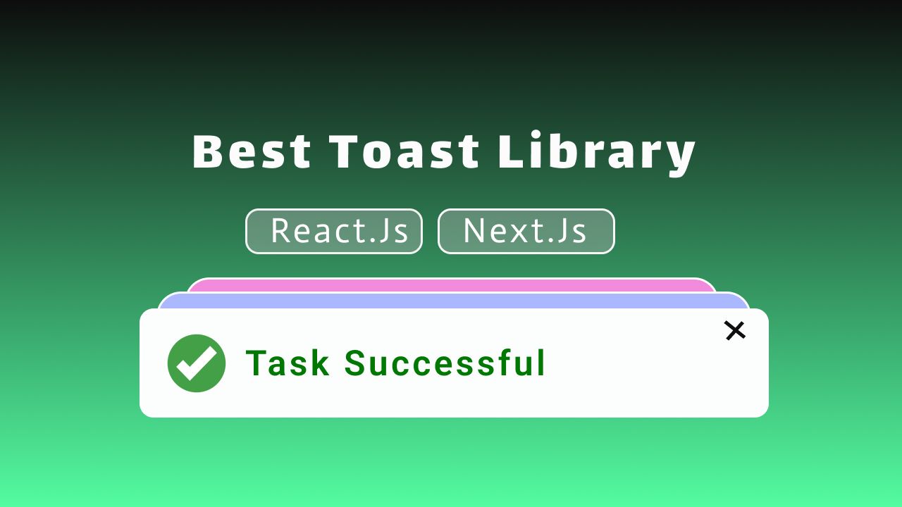
toast the function takes a string as a message and when we click on the button it will show a notification like this.
Great. we successfully implemented Toastfy.
Step 4: Customization
Now there are many customizations and variations available.
We can change the toast’s position, type, theme, and many other options.
Visit official documentation for live demos.
Types
Mainly these toasts are of five types
- Default
- Info
- Success
- Error
- Warning
like if you want to show a toast for success then you can write .success after toast
Example
const notify = () => toast.success("Hello coders it was easy!");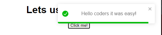
For error
const notify = () => toast.error("Hello coders it was easy!");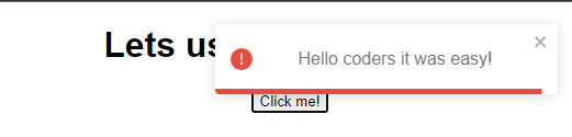
Container VS Emitter Customization
We can pass custom properties in any of two places.
In Toast Container and Toast Emitter
// In container
<ToastContainer
position="top-center"
autoClose={5000}
hideProgressBar={false}
newestOnTop={false}
closeOnClick
rtl={false}
pauseOnFocusLoss
draggable
pauseOnHover
theme="light"
/
//In emitter
toast.error('🦄 Wow so easy!', {
position: "top-center",
autoClose: 5000,
hideProgressBar: false,
closeOnClick: true,
pauseOnHover: true,
draggable: true,
progress: undefined,
theme: "light",
});If we customize in the container itself it’s going to apply for all toast through the application whereas if we customize in the emitter when we trigger toast it is going to apply for that toast only.
More Customization
Toastify is not limited to strings only, we can pass any valid react elements, like strings, numbers, or components.
and there are many more customization options visit the official documentation.
Conclusion
Overall react-toastify is an all-in-one solution for toasts and notifications in great with lots of customization
Sourcecode for this tutorial.