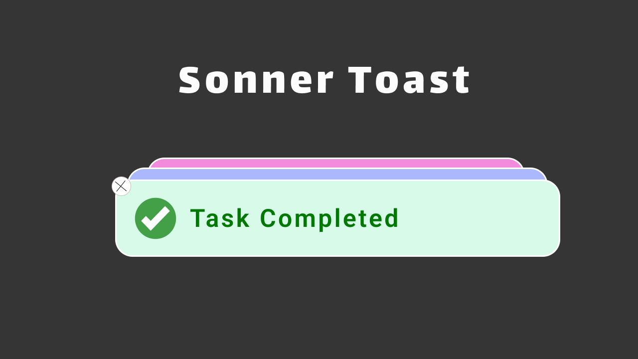
Sonner is an excellent React component for displaying Toast messages in Next.js or React.js apps. While there are similar packages like React Toastify that also facilitate the display of toast messages, Sonner stands out for its smooth performance and elegant presentation. It is so smooth and gives a very elegant feeling while displaying toast messages.
Sonner Toast provides many types of toast messages and has a feature to add custom styling and components to show in the Toast messages.
Enough talking let’s see how we can use Sonner in our Nextjs app ( you can follow this tutorial for React also :D).
Step 1: Setting up the project
As Sonner is a React js component we can use it in any of both frameworks, the process is almost the same for both.
Here I have created a React application
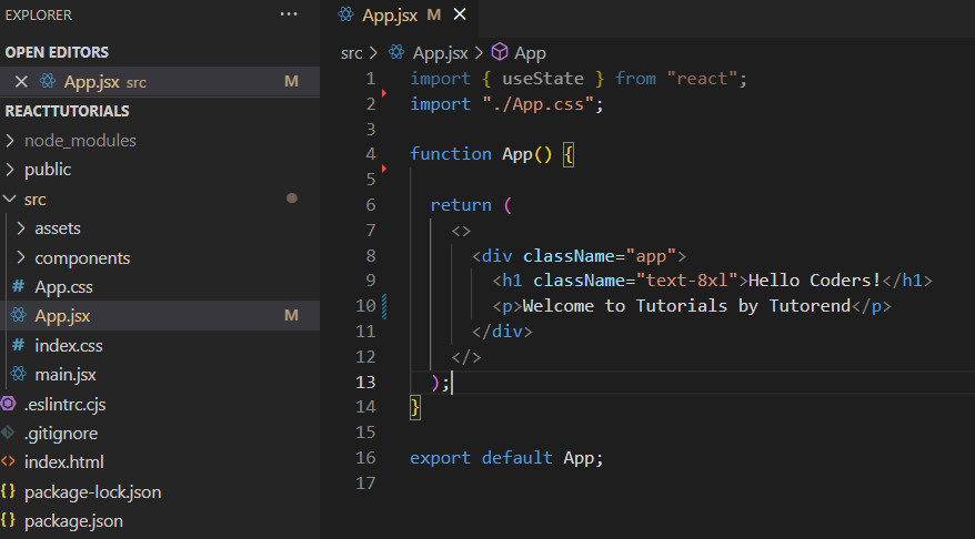
In this project, you can see I have created a components folder, that I am later going to use to create Toast components.
Step 2: Installing Sonner
Use the below command to install sonner
npm i sonnerStep 3: Showing basic toast
To show a toast message, we need to utilize two components from the Sonner library.
- Toaster: This component serves as the wrapper for all displayed messages, although we can place it any where its preferred to be placed in our root component.
- Toast: A method provided by Sonner to transmit messages to the library, triggering the display of a toast message.
Here I am going to put <Toaster /> component in App.js
import { Toaster } from "sonner";
import "./App.css";
function App() {
return (
<>
<div className="app">
<Toaster />
<h1 className="text-4xl">Hello Coders!</h1>
</div>
</>
);
}
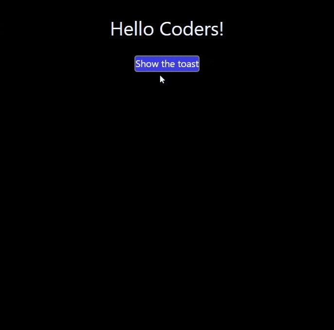
export default App;Now I am going to use Toast funtion to show a messege
Typically, we would employ our business logic to programmatically show a toast message. However, in the meantime, I am adding a button. Upon clicking the button, it will trigger a function notify(). Inside that function, I will call the Toast function and pass a message string.
import { Toaster, toast } from "sonner";
import "./App.css";

function App() {

  const notify = () => toast('This is a sonner toast');

  return (
    <>
      <div className="app">

        <Toaster />

        <h1 className="text-4xl">Hello Coders!</h1>

        <button onClick={notify}>
          Show the toast
        </button>
      </div>
    </>
  );
}

export default App;
Output
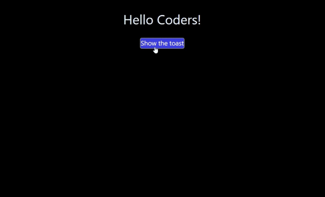
Great we have successfully rendered a sonner toast.
Step 4: Customization
Now, there are numerous customizations and variations available. We can modify the toast’s position, type, theme, and many other options. Visit the official documentation for live demos.
Types
Thsese are available types of toast messeges we can render.
- Default
- Description
- Success
- Info
- Warning
- Error
- Action
- Promise
- Custom
1. Success
Lets try success first, to use a different variation we just need to add type after toast funtion.
For example .success
const notify = () => toast.success("Hello coders it was easy!");Output
Here you can see these toasts are mono chromatic, to show colorful toast we can use richColors props in <Toaster />.
<Toaster richColors />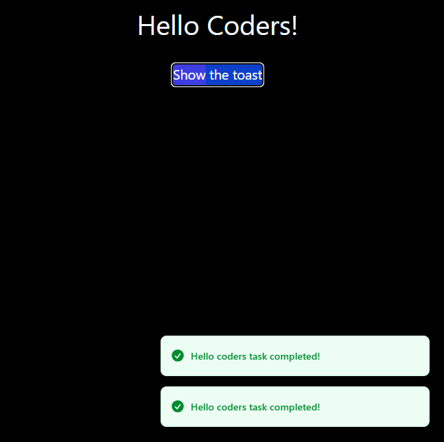
2. Warning
const notify = () => toast.warning("Hello coders warning!");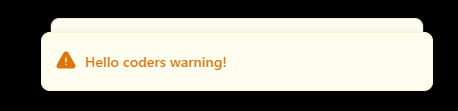
3. Error
const notify = () => toast.error("Hello coders error!");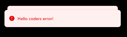
4. Action
We can render an action button along with messege, clicking on it will call the function passed to onClick listener.
const notify = () => toast('My action toast', {
    action: {
      label: 'Action',
      onClick: () => console.log('Action!'),
    },
  });;
5. Promise
Whenever we create a promise like seaeching or submiting a request, we can use sonner promise toast.
We pass a promise in toast.promise() and Initially it will show loading messege that we set, once the promise is resolved it will show the success messege, we can even include result data in success messege. Check out this example:
toast.promise(myPromise, {
loading: 'Loading...',
success: (data) => {
return `${data.name} toast has been added`;
},
error: 'Error',
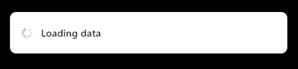
});6. Loading
When you want to handle varous states manually instead of using promise you can use sonner loading toast, it renders a toast with a loading spinner.
Other Props
Now there are still many customization available and different props you can use to custumize the toast messeges as per your need some of the props and their funtionalities are as below.
| Property | Description | Default |
|---|---|---|
| description | Toast’s description, renders underneath the title. | - |
| closeButton | Adds a close button which shows on hover. | false |
| invert | Dark toast in light mode and vice versa. | false |
| important | Control the sensitivity of the toast for screen readers | false |
| duration | Time in milliseconds that should elapse before automatically closing the toast. | 4000 |
| position | Position of the toast. | bottom-right |
| dismissible | If false, it’ll prevent the user from dismissing the toast. | true |
| icon | Icon displayed in front of toast’s text, aligned vertically. | - |
| action | Renders a primary button, clicking it will close the toast. | - |
| cancel | Renders a secondary button, clicking it will close the toast. | - |
| id | Custom id for the toast. | - |
| onDismiss | The function gets called when either the close button is clicked, or the toast is swiped. | - |
| onAutoClose | Function that gets called when the toast disappears automatically after it’s timeout (duration` prop). | - |
| unstyled | Removes the default styling, which allows for easier customization. | false |
| actionButtonStyles | Styles for the action button | {} |
| cancelButtonStyles | Styles for the cancel button | {} |
Conclusion
Overall sonner toast is all in one package for you if you want to display smooth toast messeges in your applicaiton.
I hope you find this tutorial easy and helpful, stay tuned to Tutorend.


