Bootstrap Icons is a Free, high-quality, open-source icon library with over 2,000 icons. You can use them as you like SVGs, SVG sprite, or web fonts.
We can use Bootstrap Icons in two ways in our Next js or React js projects
- One way you can use Bootstrap Icons is by installing the official package
bootstrap-icons - React Bootstrap Icons is another unofficial React Components package for Bootstrap Icons that can be used to import and use Bootstrap Icons in our Nextjs or React js projects.
Let’s get started with the first method.
Project Setup
Ensure you already have created a Next js project or React project in case you are using React.
Here’s what my project looks like this
Method 1: bootstrap-icons
To use with bootstrap-icons we have to
- Install
bootstrap-iconswhich installs all the SVGs and icon fonts. - Import
bootstrap-icons/font/bootstrap-icons.cssin root layout
Step 1: Installing Bootstrap Icons
To install Bootstrap icons run the following command in terminal
npm i bootstrap-iconsStep 2: Import CSS
Now we have to add CSS for fonts to use Bootstrap Icons Using web fonts <i> method.
In Next js 14 import the CSS file in root layout.js
import { Inter } from "next/font/google";
import "./globals.css";
import "bootstrap-icons/font/bootstrap-icons.css"

const inter = Inter({ subsets: ["latin"] });

export const metadata = {
  title: "Create Next App",
  description: "Generated by create next app",
};

export default function RootLayout({ children }) {
  return (
    <html lang="en">
      <body className={inter.className}>{children}</body>
    </html>
  );
}
Step 3: Using Icons
Now we can use Bootstrap Icons in any of your components, like below I am using house-heart icon in my home page.
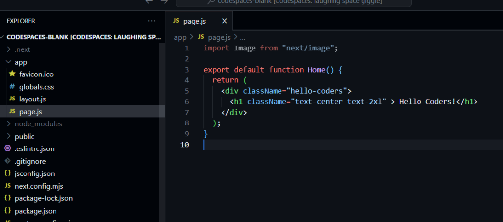
import Image from "next/image";

export default function Home() {
  return (
    <div className="hello-coders">
      <h1 className="text-center text-2xl" > Hello Coders!</h1>
      <i class="bi bi-house-heart"></i>
    </div>
  );
}
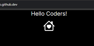
Step 4: Styling
Now we can style our icons using just CSS, like I am setting font-size=50px
import Image from "next/image";

export default function Home() {
  return (
    <div className="hello-coders text-center ">
      <h1 className="text-center text-2xl" > Hello Coders!</h1>
      <i class="bi bi-house-heart" style={{fontSize:"50px"}}></i>
    </div>
  );
}
Output
For more information, you can visit the official website.
Method 2: Using react-bootstrap-icons
React Bootstrap Icons is an unofficial package that wraps all the bootstrap icons in a React Component which we can just import and use in our project as a component.
Step 1: Install react-bootstrap-icons
To use icons we need to install react-bootstrap-icons in our project using following command
- npm
- yarn
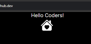
npm i react-bootstrap-iconsStep 2: Using icons
Now we can simply import icons and use them as a React component
import Image from "next/image";

import { HouseHeartFill } from 'react-bootstrap-icons'

export default function Home() {
  return (
    <div className="hello-coders !text-center mx-auto items-center ">
      <h1 className=" text-xl" > Hello Coders!</h1>

      {/* <i class="bi bi-house-heart" style={{fontSize:"50px"}}></i> */}

      <div className="mx-[48%]  " >

        <HouseHeartFill size={50}   />

      </div>


    </div>
  );
}
Output
Icons names
The icon names are the PascalCase version of the original name. For those icons whose name begins with a number, the Icon prefix will be used. Examples: arrow-right → ArrowRight, 1-circle → Icon1Circle.
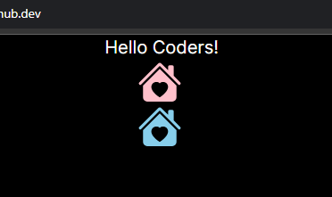
Step 3: Customization
We can pass 4 types of props to customize the icons they are below
| Name | Type | Description |
|---|---|---|
color? | string | color of the icon |
size? | string | number | size of the icon (width and height) |
title? | string | provides an accessible, short-text description |
className? | string | bi bi-{icon-name} and add your own classes |
Let’s see an example, of how we can use these props
import { HouseHeartFill } from 'react-bootstrap-icons'

export default function Home() {
  return (
    <div className="hello-coders !text-center mx-auto items-center ">
      <h1 className=" text-xl" > Hello Coders!</h1>

      {/* <i class="bi bi-house-heart" style={{fontSize:"50px"}}></i> */}

      <div className="mx-[48%]  " >

        <HouseHeartFill size={50} color='pink' className='my-icon' title="This is an HouseHeart Icon"    />
        <HouseHeartFill size={50} color='skyblue' className='my-icon2' title="This is an HouseHeart Icon"    />

      </div>


    </div>
  );
}
Output
Conclusion
Hope now you know how to use Bootstrap Icons in your next JS or React JS projects, there are still many ways to use Bootstrap Icons but I thought these two are the quickest way.
Visit official documentation for more information, Till then stay healthy keep coding, and Keep visiting Tutorend also we have a YouTube channel please checkout.

