Showing toast messages in react apps is a common feature to add, as it’s one of the quickest ways to give feedback to users. There are many toast notification libraries available for React one of them is Notistack.
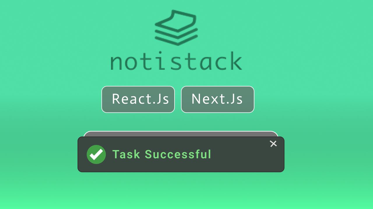
Notistack is a slick and robust notification library for React providing versatile and highly customizable snackbars ( toast messages ).
Key features of Notistack include
- Stackable Notifications:- Stack in the name describes the ability of snack bars to be stacked simultaneously.
- Customizations:- Notistack provides extensive customization options, including variant styling, duration control, and the ability to add actions like buttons to notifications.
- Position:- Notifications can be positioned in various corners of the screen, allowing developers to place alerts where they are most effective.
- Dismissal Options:- Notifications can be dismissed manually or automatically after a specified duration. They can also be dismissed individually or all at once.
Now let’s see how we can use Notistack in our Nextjs or React.js applications,
Project setup
I hope you already have a Next js project, if not create a new Next js project with the following command.
npx create-next-app@latest my-appI am creating a Nextjs project with app router for this tutorial but the process is similar for the older versions.
Initially, this is how my homepage looks like
export default function Home() {
  return (
    <main className="text-center" >

      <h1>Notistack</h1>

    </main>
  );
}
Step 1: Installing Notistack
Now open a terminal inside your project and run the following command to install notistack in your project.
- npm
- yarn
npm install notistackStep 2: Basic Usage
We can set it to display Notistack snack bars either in a specific page or in the whole application
On a specific page or component
We place SnackbarProvider component anywhere in the components, but first we need to import it from notistack like below.
import { SnackbarProvider } from 'notistack';and use it anywhere in your component
import { SnackbarProvider } from 'notistack';

export default function Home() {
  return (
    <main className="text-center" >

      <SnackbarProvider />

      <h1>Notistack</h1>

    </main>
  );
}
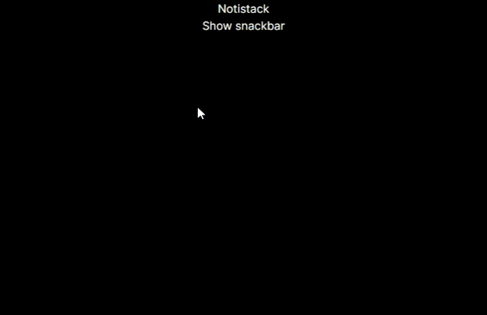
Now we need to use the enqueueSnackbar method from notistack to render snackbars. Here, I am adding a button that, when clicked, will call enqueueSnackbar to show the snackbar.
"use client"

import { SnackbarProvider, enqueueSnackbar } from 'notistack';

export default function Home() {
  return (
    <main className="text-center" >

      <SnackbarProvider />

      <h1>Notistack</h1>

      <button onClick={() => enqueueSnackbar('Hello Coders!')}>Show snackbar</button>


    </main>
  );
}
Output
In the whole project
With this method, we will be able to display the snackbar throughout our whole project by adding the provider just once in a root level component, ie. in the Nextjs app router root layout.js
Currently, this is my root layout
import { Inter } from "next/font/google";
import "./globals.css";

const inter = Inter({ subsets: ["latin"] });

export const metadata = {
  title: "Create Next App",
  description: "Generated by create next app",
};

export default function RootLayout({ children }) {
  return (
    <html lang="en">
      <body className={inter.className}>{children}</body>
    </html>
  );
}
Now we are going to use SnackbarProvider to wrap our whole app so that we’ll be able to use useSnackbar hook to show and close Snackbars, like below.
import { Inter } from "next/font/google";
import "./globals.css";

import { SnackbarProvider } from 'notistack';

const inter = Inter({ subsets: ["latin"] });

export const metadata = {
  title: "Create Next App",
  description: "Generated by create next app",
};

export default function RootLayout({ children }) {
  return (
    <html lang="en">
      <body className={inter.className}>
        <SnackbarProvider>
          {children}
        </SnackbarProvider>

      </body>
    </html>
  );
}
This isn’t going to work as Notistack requires the component to be a client component so we are going to create an additional component called SnackbarProviderClient.js and export SnackbarProvider as Notistack provider i.e now a client-side provider as we have used use client on the top.
'use client'

export { SnackbarProvider as NotistackProvider } from 'notistack'
Now in the root layout.js we can import NotistackProvider from SnackbarProviderClient.js
import { Inter } from "next/font/google";
import "./globals.css";

import { NotistackProvider } from "./SnackbarProviderClient";

const inter = Inter({ subsets: ["latin"] });

export const metadata = {
  title: "Create Next App",
  description: "Generated by create next app",
};

export default function RootLayout({ children }) {
  return (
    <html lang="en">
      <body className={inter.className}>
        <NotistackProvider>
          {children}
        </NotistackProvider>
      </body>
    </html>
  );
}
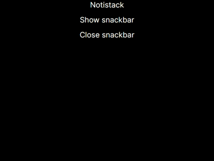
Now we can import and use useSnackbar hook from Notistack in any client component in our project.
For example, in page.js we have restructured the enqueueSnacbar method from useSnackbar to render snack bars.
"use client"

import { useSnackbar } from 'notistack';

export default function Home() {

  const { enqueueSnackbar } = useSnackbar();

  return (
    <main className="text-center" >

      <h1>Notistack</h1>

      <button onClick={() => enqueueSnackbar('Hello Coders!')}>Show snackbar</button>


    </main>
  );
}
Another method we can use is closeSnackbar to close the snackbars programmatically

Most used Props
Notistack API provides lots of props and customizations let’s talk about some of the most used props that might be useful for you too.
Maximum snackbars
This can used to limit the number of props we can show at once.
To use this props we can just pass maxSnack value in the SnackbarProvider in our case its NotistackProvider in the root layout.js
import { Inter } from "next/font/google";
import "./globals.css";

import { NotistackProvider } from "./SnackbarProviderClient";

const inter = Inter({ subsets: ["latin"] });

export const metadata = {
  title: "Create Next App",
  description: "Generated by create next app",
};

export default function RootLayout({ children }) {
  return (
    <html lang="en">
      <body className={inter.className}>

        <NotistackProvider maxSnack={3}>
          {children}
        </NotistackProvider>

      </body>
    </html>
  );
}
Output
Hide duration
We can set the duration after which the snackbars disappear
We can set it in either the main Provider (SnackbarProvider) or in individual snackbars
<SnackbarProvider autoHideDuration={1000}>
  <App />
</SnackbarProvider>
const message = 'Your notification here'
enqueueSnackbar(message, { autoHideDuration: 1000 })
Prevent duplicate
Sometime its possible that same message gets render multiple times, but we can prevent this by setting preventDuplicate to true. If a user-defined key is passed in the options of enqueueSnackbar, then this prevents snackbars with the same key from being displayed multiple times.
<SnackbarProvider preventDuplicate>
  <App />
</SnackbarProvider>
const message = 'You only see me once.'
enqueueSnackbar(message, {
  preventDuplicate: true
})
To know about more of these props visit the official documentation.
API
Notistack API provides lots of features and customization for both Provider and Renderer ( enqueueSnackbar ). Some of them are mutual i.e., can be used in both but some are specific to each.
Mutual Props
These props can be passed in SnackbarProvider props, as well as options parameter of enqueueSnackbar.
| Mutual Props | Description | Type | Default |
|---|---|---|---|
| SnackbarProps | Properties applied to the Snackbar root element. | Object | – |
| TransitionComponent | The component used for the transition. See how you can use a different transition: custom transition | Component | Slide |
| TransitionProps | Properties applied to Transition component. | Object | – |
| action | Callback used for getting action(s). actions are mostly buttons displayed in Snackbar. | React.ReactNode | func | – |
| anchorOrigin | The anchor of the Snackbar. | { horizontal: left | center | right, vertical: top | bottom } | { horizontal: left, vertical: bottom } |
| autoHideDuration | Number of milliseconds before automatically calling the onClose function. Set to ‘null’ to disable auto-closing. | number | null | 5000 |
| className | Custom class name. | string | – |
| disableWindowBlurListener | If true, the autoHideDuration timer will expire even if the window is not focused. | boolean | false |
| hideIconVariant | Hides iconVariant if set to true. | boolean | false |
| onClose | Callback fired before snackbar requests to get closed. | func | – |
| preventDuplicate | Ignores displaying multiple snackbars with the same message. | boolean | false |
| style | Custom inline styles. | React.CSSProperties | – |
| transitionDuration | Duration for the transition, in milliseconds. | { enter: 225, exit: 195 } | { enter: 225, exit: 195 } |
| variant | Easily display different variants of snackbars. | default | error | success | warning | info | default |
| onEnter | Callback fired before the transition is entering. | func | – |
| onEntered | Callback fired when the transition has entered. | func | – |
| onExit | Callback fired before the transition is exiting. | func | – |
| onExited | Callback fired when the transition has exited. | func | – |
SnackbarProvider props
| SnackbarProvider Props | Description | Type | Default |
|---|---|---|---|
| Components | Mapping between variants and a custom component. | Object | – |
| children | Most of the time this is your App. every component from this point onward will be able to show snackbars. | React.ReactNode | React.ReactNode[] | – |
| classes | Override or extend the styles applied to the container component or Snackbars. | Object | – |
| dense | Denser margins for snackbars. Recommended to be used on mobile devices. | boolean | false |
| domRoot | Valid HTML Node element, used to target ReactDOM.createPortal. Apply position: absolute to SnackbarContainer. | HTMLElement | – |
| iconVariant | Mapping between variants and an icon component. | Object | – |
| maxSnack | Maximum snackbars that can be stacked on top of one another. | number | 3 |
enqueueSnackbar Options
| enqueueSnackbar Options | Description | Type | Default |
|---|---|---|---|
| key | Unique identifier to reference a snackbar. | string | number | random unique string |
| persist | Snackbar stays on the screen, unless it is dismissed (programmatically or through user interaction). | boolean | false |
Conclusion
Hope this tutorial helped you to use Notistack in your project, for more information visit the official documentation . Thanks for visiting to watch this tutorial in video format subscribe to our YT Channel.


