There are 100s of UI Libraries like Material UI, Chakra UI, Bootstrap, etc. while using these libraries we have to Install whole library and only then we can use components and themes they provide. Shadcn UI is an UI library which uses different approach than this, Shadcn UI is based on Tailwind CSS and Radix UI, its most loved and trending among the developer community with over 50K stars on GItHub.
In Shadcn we dont install the whole library all at once instead we copy the source code for the component we need, this helps to keep our project as light as possible also as we are copying the actual source code of the components we can also modify them as we like.
PROs and CONs of using Shadcn UI
PROs
- Minimilistic : Each component is very minimislitic and higly customizable.
- Accessibility : Shadcn components are fully accessible and follows Web Content Accessibility Guidelines (WCAG) standards.
- Easy to Use : We just need to add the component we need and we are ready to use it anywhere in our project.
CONs
Only con that you may find is that as we are adding components everytime it may feel tedious.
Getting started with Shadcn UI
Now lets see how we can integrate Shadcn UI in our Next Js app and use its components
Step 1 : Creating new Next JS app
FIrst of all we need a Next Js app to setup Shadcn UI, you can create a new nextjs app using- following command
npx create-next-app@latest my-appYou can change my-app to whatever name you want to keep for your app.
Press Enter and follow the prompt and configure your app, make sure to choose Tailwind CSS as Shadcn UI depends upon it.
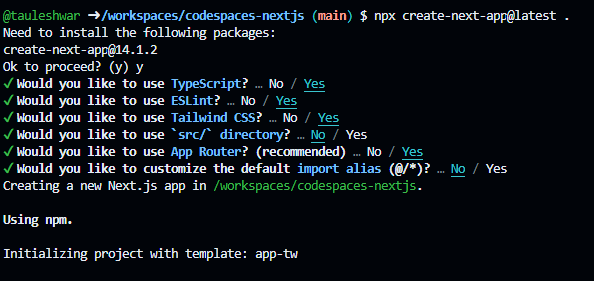
after few seconds a success messege will be shown that means your application has been created successfully.
Navigate to your project directory using cd /my-app
Now run npm run dev to run your application in development mode.
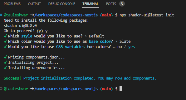
Step 2 : Initialize dependencies for Shadcn UI
Open new terminal in your project and run npx shadcn-ui@latest init to initialize all Shadcn UI components in your project.
Some prompts will be shown to setup components.json just keep pressing Enter to select default ones.
Step 3 : Configure Fonts ( Optional )
Shadcn UI by default uses Inter font from google but you can change it to whatever you like, to do that you need to edit code inside root Layout.tsx
import type { Metadata } from "next";
import { Inter } from "next/font/google";
import "./globals.css";

const inter = Inter({ subsets: ["latin"] });

export const metadata: Metadata = {
  title: "Create Next App",
  description: "Generated by create next app",
};

export default function RootLayout({
  children,
}: Readonly<{
  children: React.ReactNode;
}>) {
  return (
    <html lang="en">
      <body className={inter.className}>{children}</body>
    </html>
  );
}
Also import cn funtion from utils and use it to wrap tailwind classes which you’ll write on your components because cn funtion is helper funtion for Tailwind Merge and below is the code of utils.ts
import { type ClassValue, clsx } from "clsx"
import { twMerge } from "tailwind-merge"
export function cn(...inputs: ClassValue[]) {
  return twMerge(clsx(inputs))
}
Use it like below code in root layout.tsx
import type { Metadata } from "next";
import { Inter } from "next/font/google";
import "./globals.css";
import { cn } from "@/lib/utils";
const inter = Inter({ subsets: ["latin"] });
export const metadata: Metadata = {
  title: "Create Next App",
  description: "Generated by create next app",
};
export default function RootLayout({
  children,
}: Readonly<{
  children: React.ReactNode;
}>) {
  return (
    <html lang="en">
      <body className={cn("min-h-screen mx-auto", inter.className)}>{children}</body>
    </html>
  );
}
4. Adding and using Components from Shadcn
As I already told you unlike other UI libraries we can independently add each components from Shadcn UI in our project.
For example: Lets add a button from Shadcn in our Home page ie. page.tsx
Run following command to add button component in our project
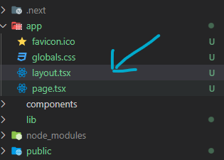
npx shadcn-ui@latest add buttonIn page.tsx remove default code and write following code to use <Button> component from button
import { Button } from "@/components/ui/button";
import { cn } from "@/lib/utils";
export default function Home() {
return (
<div className={cn("text-center mx-auto ")}>
<h1>Home Page</h1>
<Button >Button</Button>
</div>
)
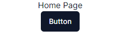
}Output
In your project you can see a folder called components created by Shadcn insde which you can see a subfolder called ui which is going to hold source code for the components we add in our projet from Shadcn UI, and we can even modify the source code to change look and behaviour of the component.
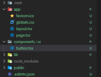
For example lets see the source code for <Button> components
import * as React from "react"
import { Slot } from "@radix-ui/react-slot"
import { cva, type VariantProps } from "class-variance-authority"
import { cn } from "@/lib/utils"
const buttonVariants = cva(
  "inline-flex items-center justify-center whitespace-nowrap rounded-md text-sm font-medium ring-offset-background transition-colors focus-visible:outline-none focus-visible:ring-2 focus-visible:ring-ring focus-visible:ring-offset-2 disabled:pointer-events-none disabled:opacity-50",
  {
    variants: {
      variant: {
        default: "bg-primary text-primary-foreground hover:bg-primary/90",
        destructive:
          "bg-destructive text-destructive-foreground hover:bg-destructive/90",
        outline:
          "border border-input bg-background hover:bg-accent hover:text-accent-foreground",
        secondary:
          "bg-secondary text-secondary-foreground hover:bg-secondary/80",
        ghost: "hover:bg-accent hover:text-accent-foreground",
        link: "text-primary underline-offset-4 hover:underline",
      },
      size: {
        default: "h-10 px-4 py-2",
        sm: "h-9 rounded-md px-3",
        lg: "h-11 rounded-md px-8",
        icon: "h-10 w-10",
      },
    },
    defaultVariants: {
      variant: "default",
      size: "default",
    },
  }
)
export interface ButtonProps
  extends React.ButtonHTMLAttributes<HTMLButtonElement>,
    VariantProps<typeof buttonVariants> {
  asChild?: boolean
}
const Button = React.forwardRef<HTMLButtonElement, ButtonProps>(
  ({ className, variant, size, asChild = false, ...props }, ref) => {
    const Comp = asChild ? Slot : "button"
    return (
      <Comp
        className={cn(buttonVariants({ variant, size, className }))}
        ref={ref}
        {...props}
      />
    )
  }
)
Button.displayName = "Button"
export { Button, buttonVariants }
As you can see in source code we can use varients of the <Button> component
We have 6 varients of <Button>
- Default
- Destructive
- Outline
- Secondary
- Ghost
- Link
To use varient just pass varient prop with any of 6 values
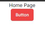
Example: Destructive
import { Button } from "@/components/ui/button";
import { cn } from "@/lib/utils";
export default function Home() {
  return (
    <div className={cn("text-center mx-auto ")}>
      <h1>Home Page</h1>
      <Button variant="destructive" >Button</Button>
    </div>
  )
}
Additional Features
Theme Editor
While cofiguring Shadcn you might have noticed that we choose from two themes Default and New York configuration for the theme exits in global.css in your project
@tailwind base;
@tailwind components;
@tailwind utilities;

@layer base {
  :root {
    --background: 0 0% 100%;
    --foreground: 0 0% 3.9%;
    --card: 0 0% 100%;
    --card-foreground: 0 0% 3.9%;

    --popover: 0 0% 100%;
    --popover-foreground: 0 0% 3.9%;

    --primary: 0 0% 9%;
    --primary-foreground: 0 0% 98%;

    --secondary: 0 0% 96.1%;
    --secondary-foreground: 0 0% 9%;

    --muted: 0 0% 96.1%;
    --muted-foreground: 0 0% 45.1%;

    --accent: 0 0% 96.1%;
    --accent-foreground: 0 0% 9%;

    --destructive: 0 84.2% 60.2%;
    --destructive-foreground: 0 0% 98%;
    --border: 0 0% 89.8%;
    --input: 0 0% 89.8%;
    --ring: 0 0% 3.9%;

    --radius: 0.5rem;
  }

  .dark {
    --background: 0 0% 3.9%;
    --foreground: 0 0% 98%;

    --card: 0 0% 3.9%;
    --card-foreground: 0 0% 98%;

    --popover: 0 0% 3.9%;
    --popover-foreground: 0 0% 98%;

    --primary: 0 0% 98%;
    --primary-foreground: 0 0% 9%;

    --secondary: 0 0% 14.9%;
    --secondary-foreground: 0 0% 98%;

    --muted: 0 0% 14.9%;
    --muted-foreground: 0 0% 63.9%;

    --accent: 0 0% 14.9%;
    --accent-foreground: 0 0% 98%;

    --destructive: 0 62.8% 30.6%;
    --destructive-foreground: 0 0% 98%;

    --border: 0 0% 14.9%;
    --input: 0 0% 14.9%;
    --ring: 0 0% 83.1%;
  }
}

@layer base {
  * {
    @apply border-border;
  }
  body {
    @apply bg-background text-foreground;
  }
}
As you can see we have configuration for both light and dark mode
Although we can manually customize the theme a better way Shadcn UI provides is Theme Editor where we can visually configure our theme
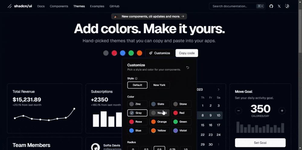
Customize theme and copy code by clicking on copy code, and replace the theme code in global.css
Conclusion
We just saw basic usage of Shadcn UI but we can do lot more than just adding a button eg. we can add custom themes, we can create complex layouts like dashboard and all.
To learn more and see all available component visit official documentation here.
Thanks for reading till here, Stay healthy Keep coding 🙂