Carousels are very common elements used on websites to show sliding cards you can see below

Carousels can have different styles, layouts, sizes, and behaviors like autoscrolling and auto sliding.
Implementing a carousel can be very hectic in React or Next js if done from scratch but luckily we have an awesome component to make our job easier and it’s called react-responsive-carousel.
React Responsive Carousel is very easy to use and we get lots of props and customization to configure it according to our needs.
Let’s see how we can use react-responsive-carousel in our React.js or Next js project within a minute.
Project Setup
Of course, we need a React js or Next js project in which we are going to implement the carousel component.
If you already have a project then you can skip to the next step otherwise you can create a new React js or Next js project.
Installing react-responsive-carousel
Now open a terminal inside your project folder and install react-responsive-carousel by running the following commands.
Using NPM
npm install react-responsive-carouselUsing Yarn
yarn add react-responsive-carouselImporting the Carousel component and its CSS
Now as react-responsive-carousel is installed in our project we can import the carousel component and CSS file required from the react-responsive-carousel library.
import { Carousel } from 'react-responsive-carousel';
import "react-responsive-carousel/lib/styles/carousel.min.css";
Import Carousel component and CSS file in the component or page in which you want to show the carousel component.
Alternatively, you can create a utility component for the carousel and reuse it in several pages, do whatever suits best for you.
Using Carousel component to show the carousel
Now to show the carousel we can just use the carousel component anywhere on the page, but to make it work properly we have to pass some children that are going to be shown and slide in the Carousel component.
            <Carousel>
                <div>
                    <img src="https://picsum.photos/200/300?random=1" />
                    <p className="legend">Legend 1</p>
                </div>
                <div>
                    <img src="assets/2.jpeg" />
                    <p className="legend">Legend 2</p>
                </div>
                <div>
                    <img src="assets/3.jpeg" />
                    <p className="legend">Legend 3</p>
                </div>
            </Carousel>
the divs which contain an image and text are going to be shown as items in the carousel component.
But make sure to pass the path of actual images in src images to make it work properly.
You can use your own source of images but in this tutorial, I am going to use some dummy images from lorem.photos ( API for dummy images by Unsplash ).
I’m getting three random images in the below code.
      <Carousel>
        <div>
          <img src="https://picsum.photos/200/300?random=1" />
          <p className="legend">Legend 1</p>
        </div>
        <div>
          <img src="https://picsum.photos/200/300?random=2" />
          <p className="legend">Legend 2</p>
        </div>
        <div>
          <img src="https://picsum.photos/200/300?random=3" />
          <p className="legend">Legend 3</p>
        </div>
      </Carousel>
Now this is how my app.js page looks now
import "./styles.css";
import { Carousel } from "react-responsive-carousel";
import "react-responsive-carousel/lib/styles/carousel.min.css";

export default function App() {
  return (
    <div className="App">
      <h1>Hello Coders!</h1>
      <Carousel>
        <div>
          <img src="https://picsum.photos/200/300?random=1" />
          <p className="legend">Legend 1</p>
        </div>
        <div>
          <img src="https://picsum.photos/200/300?random=2" />
          <p className="legend">Legend 2</p>
        </div>
        <div>
          <img src="https://picsum.photos/200/300?random=3" />
          <p className="legend">Legend 3</p>
        </div>
      </Carousel>
    </div>
  );
}
Output
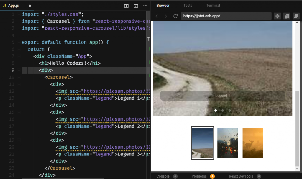
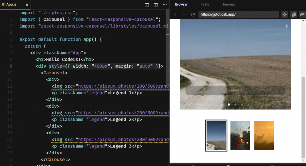
As you can see our carousel is working fine but it’s taking 100% width of the page and you may not want to do this in your project in that case you can wrap the Carousel component in a div and set its width and position.
Below you can see I have contained the carousel in a dive with width = 400px and margin auto.
Now we have successfully implemented the basic carousel in our app, but there are several props that we can utilize to customize the look and behavior of the carousel.
Some of them are:
- axis: Determines the direction of the slider. You can set it to either
horizontal(default) orvertical. - autoPlay: When set to
true, the carousel will change the slide automatically based on theintervalprop. - interval: Interval in milliseconds for automatically transitioning to the next item when
autoPlayis enabled.


