Modals or PopUps are a great way to show some urgent and important information when a user visits a website, I have implemented a custom Modal using my React skills but it may take some time to implement for you based on your project requirements. But don’t worry because there is a component available for this on NPM it is called react-modal.
Let’s see how we can use react-modal to display modals.
Step 1: Setting up projects
First of all, we need a react or next js project in order to use modals. If you already have a project you can skip to step 2.
For this tutorial, I am going to create a new React app.
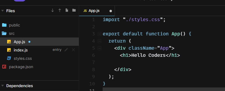
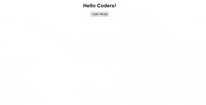
This is how my app looks now.
Step 2: Installing react-modal package
We need to install the react-modal package in order to use it in our app and for that you can use
npm i react-modalThis command will install the react-modal component; now we can use it in any component.
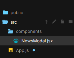
Step 3: Create a new component for the modal
Now I am going to create a new component for showing the modal and call it NewsModal
and this is the basic code for the component
export default function NewsModal() {

  return(
    <>
      <h1> This is NewsModal </h1>
    </>
  )

}
We have to import and use this component in app.js in order to show this component in the app.
import "./styles.css";
import NewsModal from './components/NewsModal'

export default function App() {
  return (
    <div className="App">
      <h1>Hello Coders!</h1>
      <NewsModal />
    </div>
  );
}
Now let’s use Modal component from react-modal.
Write the code below to import Modal the component.
import Modal from "react-modal";now we can use this component but to make it visible we have to pass a prop called isOpen and set it to true.
import Modal from "react-modal";
export default function NewsModal() {
  return (
    <>
    <Modal isOpen={true}>

      <h1> This is NewsModal </h1>
    </Modal>
    </>
  );
}
But it is not idle to show the modal all the time, we can create a state and toggle its value between true and false but initially, we are going to set it to true to show the Modal when the page is loaded.
const [showModal, setShowModal] = useState(true);is passed to isOpen={showModal}
Now this is our app.js
import { useState } from "react";
import Modal from "react-modal";

export default function NewsModal() {
  const [showModal, setShowModal] = useState(true);
  return (
    <>
    <Modal isOpen={true}>

      <h1> This is NewsModal </h1>
    </Modal>
    </>
  );
}
Toggle showModal
As initially showModal is set to true we have to change its value to false in order to hide the modal.
For this, we are going to use buttons and when we click on the button we are going to hide the modal by setting the value of showModal to false.
<button onClick={() => setShowModal(false)}>Close Modal </button>you can notice show I am setting the state in place in the button upon click by adding the event listener onClick and calling an arrow function.
Similarly whenever you want to show the Modal again or show it for the first time you have to set the showModal state to true again.
Let’s look at an example here by adding a button to our NewModal component which will help us to set the showModal to true upon click.
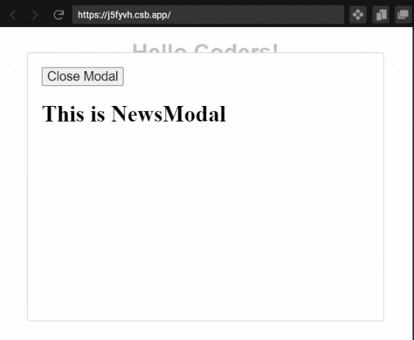
<button onClick={() => setShowModal(true)}>Open Modal</button>Now code for our NewsModal component looks like this
import { useState } from "react";
import Modal from "react-modal";

export default function NewsModal() {
  const [showModal, setShowModal] = useState(true);
  return (
    <>
      <button onClick={() => setShowModal(true)}>Open Modal</button>
      <Modal isOpen={showModal}>
        <button onClick={() => setShowModal(false)}>Close Modal </button>
        <h1> This is NewsModal </h1>
      </Modal>
    </>
  );
}
and this is what our app looks like now
Styling
We can also pass custom stylings to the Modal by passing an object of style in a prop called styles
Example:
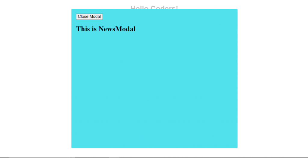
This is our custom-style object
const customStyles = {
    content: {
      width: "50%",
      margin: "auto",
      backgroundColor: "#51E1ED"
    }
  };
and we can pass it in a Modal component like this
<Modal
        style={customStyles}
        isOpen={showModal}

      >
And this is how the code for NewsModal looks now
import { useState } from "react";
import Modal from "react-modal";

export default function NewsModal() {
  const [showModal, setShowModal] = useState(true);
  const customStyles = {
    content: {
      width: "50%",
      margin: "auto",
      backgroundColor: "#51E1ED"
    }
  };
  return (
    <>
      <button onClick={() => setShowModal(true)}>Open Modal</button>
      <Modal style={customStyles}  isOpen={showModal}>
        <button onClick={() => setShowModal(false)}>Close Modal </button>
        <h1> This is NewsModal </h1>
      </Modal>
    </>
  );
}
Output
Close on click outside and press ESC
There are many props that we can use to customize our Modal’s style and behavior, we can detect multiple clicks and events on the Modal and Modal’s overlay.
For example. If we want to close the Modal when we click outside of the Modal or we want to close it when we press the ESC key on the keyboard we can use the following props.
onRequestClose takes a function and calls it when we click outside of the Modal or when we press the ESC key on the keyboard because these features are already enabled by react-modal.
If you want to disable any of them then you can set the values of these pros to false
shouldCloseOnEsc={false}
shouldCloseOnOverlayClick={false}
But for now, we want both features enabled so we don’t need to use any of these two, we just need to pass the closing function in onRequestClose
This is our final NewModal component
import { useState } from "react";
import Modal from "react-modal";

export default function NewsModal() {
  const [showModal, setShowModal] = useState(true);
  const customStyles = {
    content: {
      width: "50%",
      margin: "auto",
      backgroundColor: "#51E1ED"
    }
  };
  return (
    <>
      <button onClick={() => setShowModal(true)}>Open Modal</button>
      <Modal
      style={customStyles}
      isOpen={showModal}
      onRequestClose={() => setShowModal(false)}
      >
        <button onClick={() => setShowModal(false)}>Close Modal </button>
        <h1> This is NewsModal </h1>
      </Modal>
    </>
  );
}
Output:
Conclusion
Overall react-modal is an awesome component for modals with lots of props to customize syle and behavior and you can put any content you want inside the Modal component.
I hope you learn something about react-modal from this tutorial, Happy Coding.


